Introduction
This article presents the SmartAdorner class that allows you to design and attach adorner to any visual element in WPF using only XAML. The adorner content is defined in a data template allowing data-binding to the adorned element's data context. In this way properties from the bound model (or view model) and used and manipulated in the adorner elements in the same as in the adorned element.
To further support the design of adorners the article code also includes a Thumb-derived control that allows manipulation of coordinates using only data binding and a general control to support resizing handles in the corners.
Background
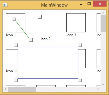
Adorners in WPF are decorations on existing elements shown in an adorner layer above other visual elements. Typical use for adorners is for dragging/resize handles on selected elements. Without the adorner layer such handles would sometimes be hidden behind other objects, making it more difficult or even impossible for the user to interact with them. The SmartAdorner solution presented here is general and supports other types of handles and dynamic and interactive decorations too.
An adorner is always associated with an adorned element which has to be passed as an argument to the Adorner constructor. Thus it is not possible to create adorners directly in WPF, without help from a helper, such as the SmartAdorner presented here. SmartAdorner derives from Adorner but has attached properties to allow definition of the XAML content in a data template and to dynamically show and hide the adorner.
When searching the internet for existing solutions I did not find anyone as simple as this one, also supporting data binding.
Using the code
Add a general adorner
To specify the content for the adorner of an element you simply set the SmartAdorner.Template attached property like this:
Collapse | Copy Code
<StackPanel Name="test" a:SmartAdorner.Visible="{Binding IsSelected}" >
<Rectangle Width="64" Height="64" Stroke="Black" Fill="White" />
<TextBlock Text="{Binding Text}" />
<a:SmartAdorner.Template>
<DataTemplate DataType="{x:Type local:IconViewModel}" >
<Canvas>
<a:DragThumb Name="IconThumb" Canvas.Left="-6" Canvas.Top="-6" Width="12" Height="12" X="{Binding X}" Y="{Binding Y}" />
<TextBox Canvas.Top="64" Text="{Binding Text, UpdateSourceTrigger=PropertyChanged}" />
</Canvas>
</DataTemplate>
</a:SmartAdorner.Template>
</StackPanel>
In this example we adorn the StackPanel using a Canvas containing a thumb control and an text box. As demonstrated data bindings can be used. To make the adorner visible the SmartAdorner.Visible has to be set to true. In this example we use data binding to the set this dynamically when the item is selected in the containing list box.
Read more: Codeproject