
First Look
On the first day of the Microsoft Build 2013 conference the preview of Visual Studio 2013 was announced. The preview contains a new version of Blend for Visual Studio. This preview has some new features and some "old" features that didn't work in the previous version, mainly when building Windows Store apps.
The first thing noticeable after installing the preview is the new icon. Opening Blend will show you the splash screen which looks pretty much the same as the 2012 version. So does the welcome screen. A thing to note is that while all platforms are supported, when running Blend for Visual Studio 2013 Preview on Windows 8.0 you can't build create Store apps. Most of the new features described below won't be available either.
Because most of the new features are only available when building Windows Store apps I'll focus on that.
Guides and Rulers
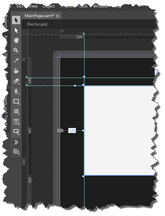
I've created a new Windows Store application, for Windows 8.1. Which is the only option at the moment. One of the big surprises in this release are the rulers are added to the designer. If you have ever worked with a tool like Photoshop this might look familiar. Dragging from one of the rulers onto the design area will draw a line to which you can snap to when working on your app. The width, height and margins of the selected element are shown on the rulers too.
Guides can also be added by dragging from an existing guide while keeping the ALT-key pressed.
Read more: Codeproject
QR: 