At //build one of the surprising immediate things I heard about was folks wanting to build custom controls right away. I knew that would happen, but not so quick on something so new (WinRT). The XAML platform did not have good support for building custom controls in the Developer Preview but now that the Consumer Preview for Windows 8 and Visual Studio 11 Beta are out, there is much better support. There are two key things when thinking about custom controls: 1) building it and 2) making it consumable by developers (even if those developers are your own company). I’ll try to articulate the methods of both here.
Defining custom versus user control
There is usually some debate in the XAML community about the definition of a custom control. For the purposes of this discussion I define a custom control as a control that provides a generic.xaml, can be styled/templated and is usually encapsulated in its own assembly which can then be distributed. A custom control can contain user controls, but generally speaking does not. A typical user control scenario is one that lives within your project and not meant to be consumed by anyone outside your project.
This definition is the same whether we are talking about C++, C# or Visual Basic. Everything below applies to all languages.
Creating the custom control
The fundamentals of a custom control are that it is a class and it provides it’s own template/style. This style/template definition usually lives in a file located at themes/generic.xaml. This is the same pattern that has existed in other XAML implementations like WPF, Silverlight and Windows Phone. The pattern is no different for Metro style apps in this regard.
The creation of the most basic custom control is very simple. A Windows SDK sample for XAML User and Custom Controls is available for you to download for the quick review and core concept. My intent here is to take that a step further for the end-to-end implementation if I were a control vendor. Let’s first create our control. For our purposes we will create a control that shows an Image and allows you to specify some Text for the label. The label, however, will be prepended with some text that comes from string resources.
In Visual Studio we will create a class library project first.
NOTE: You can create a C#/VB Class Library and keep it managed, or convert it to a WinRT component. You may also create this in C++ using the WinRT Component project type. Again, these concepts are the same, the syntax will be obviously slightly different for C++ and managed code.
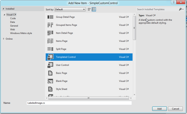
Once you create the class library (I called mine SimpleCustomControl and deleted the initial Class1.cs file that was created), add an item to the project. You can do this via right-clicking on the project and choosing add item. You will be presented with a few options, but the important one is Templated Control.
Watch was this does to your project as it will do 2 things:
Create a new class
Add a Themes folder and place a ResourceDictionary called generic.xaml in that folder
The themes/generic.xaml is very important if you use the DefaultStyleKey concept in your class. This is very much a convention-based approach. The contents of the class is very simple at this point, with the sole constructor and the DefaultStyleKey wired up:
1: namespace SimpleCustomControl
2: {
3: public sealed class LabeledImage : Control
4: {
5: public LabeledImage()
6: {
7: this.DefaultStyleKey = typeof(LabeledImage);
8: }
9: }
10: }
Read more: Tim Heuer
QR: 